Wednesday, March 30, 2011

The Southern Ideal Home Show is this weekend!


Just a heads up that the Southern Ideal Home Show will be at the NC State Fairgrounds this weekend, April 1-3.  This is the perfect time to get some great ideas for your home and yard and that's what this show will provide.  The  Triangle chapter of the Interior Design Society will have a booth at the show that features our Attic Sale.  Designers always seem to have a stash of things in their inventory that need to find new homes, so come on out and take a look at some fabulous finds.  I'll be manning the booth on Saturday night with my fun loving colleagues, so please stop by and say "hello!"


This is me, in Kindergarten.  I'll try to find that dress and wear it so you'll recognize me!

Ciao,
Anne

Monday, March 28, 2011

The leaves are back!

I love trees in every season, but have to say that I get the most excited by the sight of their emerging leaves in the Spring.  I am SO glad they're back!   I also welcome the flowers that preceed the leaves on some of my dear friends, such as the gorgeous purple redbuds that are strutting their stuff this month.

What amazing little petals these are.  And they just cover the branches of the whole tree.

And so much more.  Oh, a girl from Maine never gets over Spring in North Carolina!  So early!  So full of flowers!  So warm!  Well, it wasn't warm today, that's for sure.  But last week was in the 80's, so let's not get carried away with a pity party.  My sister in Maine had snow.   


And look at the Lambs Ears that are already up with their soft, fuzzy leaves!  Mr. Turtle is lovin' them up!  I put the hummingbird feeder out early last week, but so far, no one has come for a drink.  Last year it was right around this week when the first tiny hummer came around, so I wanted to be sure to be ready.  Will keep you posted.

If it's not quite Spring yet where you are, hang on, it's coming.

Ciao,
Anne

Friday, March 25, 2011

Find of the week is in my laundry room!

Remember this hollow core lauan door that I bought a while back at the Habitat ReStore for $2.00?
It was a beauty--no hinge marks, no doorknob hole.  It had a couple of marks on it, but barely visible.  This is what we did:


We made it into a counter over the washer and dryer!

Here's the laundry room before:


Nothing really wrong with it, (although this shot was obviously taken on a very tidy day), other than there's no place for Grandboy's shoes, which he always takes off and tosses on his way in from the garage, nor any place to put freshly dried laundry.  The basket on top is a catch-all and the little green thing is a rug where the kitty likes to sleep at night (she refuses the fancy bed I bought her).

The counter idea was from our friends, Wes and Terese.  Terese is the queen of laundry room design and once she showed me her counter top--which looks just like mine because I copied her exactly--I couldn't wait to get started.  Went to the ReStore, found the door, paid the $2.00.  Then Hub stepped in.  I'm just the instigator of projects, not the actual handyman. Hub cut the door down to the correct length.  Here it is:

He cut one end for size and then cut out where the water lines need room for the washer.  The inside of a hollow core door is SO interesting.  Lots of cardboard!  See that piece sitting on the door?  That's veneer tape that will cover up all the open edges so it ends up looking like this:


Isn't that nice?  I bought the veneer tape at Lowe's, for about $6.00 and there's a ton left for upcoming projects.  Next, Hub put 2 coats of Ebony  stain on, wiping each coat off after applying, so that we can still see the wood grain.  It makes the wood look great!  Then 3 coats of water based poly (much more expensive that oil based, but it's my preference).  Every coat of poly makes the finish look better and better.  I'm sorry I can't get a close-up picture of the wood, my camera just hates the black and looks all grainy. 

The end result is a much more useful space:


Hub did such a great job!  I got the little wire cart that sits between the washer and dryer at The Container Store here in Raleigh.  I shopped around for it and for once, The Container Store had the best price.  Now Grandboy has a place to stash his shoes when he comes in and out and they're not messy on the floor.  I placed a painting that my Mom did years ago on the counter to hide the plumbing.  A little LED puck light would be a great way to light it.  I also bought this adorable box to use as a trash basket for lint, dryer sheets, etc.:


It picks up on the gray of the cart, and the black and white of the appliances, counter and cabinet pulls and it fits on the cart.  I've got more things to do in this space--again, Terese has shown me about a dozen spacesaving laundry room ideas and I'll be implementing more of them as time allows.   Here's a photo of the window treatment in that room on the opposite wall;


It's a wacky ribbon design on faux silk and pulls the black and white across the (tiny) room.  I'll show you the Marmoleum  floor another time when I do an update on this room, but now that the counter is finished, I've given myself permission to go back to the ReStore (they have a FABulous selection of old doors) to get started on my next project!

Ciao,
Anne 


Tuesday, March 22, 2011

Learn About LED bulbs

LED lighting is coming on fast and strong.  Prices will go down (they've got to!) and the color will continue to improve, but I think what's out there right now is amazing.  Raleigh's own Cree is a big player in the game.  Watch this video,  from the Philips  website.  It's a great way to learn about an LED lightbulb.  It's a bit technical, but not bad, and at the end you get to build a bulb to see if you were paying attention.  I loved it!

Ciao,
Anne

Sunday, March 20, 2011

Interior design includes doors!


http://www.newsobserver.com/2011/03/19/1060662/open-up-the-possibilities-with.html#storylink=misearch

Let's see if this link (above) works for you.  I'm busy, busy these days, but am thinking about you and trying to find time to post.  It will slow down in a couple of days, but in the meantime, my beloved Raleigh News & Observer had this great article in Saturday's Home Section about decorating doors.  I totally agree and have some great door projects coming along that I can't wait to show you.  Until then, read the N & O!

Ciao,
Anne

Friday, March 11, 2011

Find of the Week has been found! At Suzanna's Antiques

I popped into Suzanna's Antiques this afternoon and found this fabulous little table just for you:

It's sitting in front of the shop that says "Ye Old Trading Post."  There are so many vendors at Suzanna's that I have to really pay attention to where I see things.  This table is wood, very  nice lines and just needs a bit of sanding to make it ready for your next project.

What could you do with this?  Well, first of all, it's a perfect coffee table.  It could also be a craft table for kids.  It could be a console in front of a low window, holding plants or family photos.  It could sit on the front porch or the screened-in back porch.  It could be painted a snappy shade like lime.  Marine blue.  Coral.  Panetone's-color-of-the-year honeysuckle (pink). It could just be stained or even given a clear coat(or 3) of satin poly that lets the wood grain shine. Or how about having a stainless top fitted over it?  Better, yet, a copper one.  I'm looking for a local source to do that very thing on another old piece.

Need a creative interior designer to help you come up with ideas like this?  Well, check out my website and give me a call!

Oh!  Didn't I tell you the price on this? $15.00.  Yes indeedy, $15.  I had to take myself by the hand and walk away from it so that I could give you a fair shot at it.  I was at Suzanna's for about 10 minutes when I spotted this and had already found a couple of other "finds" to show you.  This one won out because it has the combination of decent quality to work with, nice versatile shape AND a price that can't be beat. 

 You are welcome.  Enjoy the weekend.

Ciao,
Anne

Transitional interior design, Part 3, Coffee Tables and Accent Tables!

If you've read Part 1 and Part 2, you know what to look for in furniture to get that "transitional" look (reminder--a little traditional, a little modern, a little eclectic) and what direction to take in fabric choices.  Let's move on to the tables, both coffee and accent.  Don't know why this is so daunting to so many.  Maybe it's partly because there seem to be so many choices out there, yet few of them feel right (or they're cheap and cheesey and you know in your heart that they're going to look that way in your home, AND you're right!).  Sorry for all the parentheses, I'll try to stop.

If you want a coffee table that can take a lot of abuse, please buy one with a stone top or maybe a woven rattan or at least put something protective on top, like glass or plexiglass or whatever.  I have nothing against a nice wood surface from Pottery Barn, but that thing is going to scratch up in no time!  Here are some other choices:

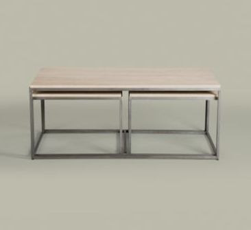
Ethan Allen
This one has a travertine top and if you look closely, you'll see that there are 2 nesting tables tucked underneath.  Brilliant.  I do love nesting tables.


Expressions Furniture, Artistica

Oh, this one (above) is SO good.  The top comes in a few choices, but the marble makes me drool (sorry about the drooling).


Expressions

I call this one the Lobster Trap.  Just my own interpretation of the look.  Love the glass, love the wood, love the clean lines and the size.  Guess I love it.

Ethan Allen

The copper top gives a glow to this piece.

Ethan Allen


Expressions

This one is a favorite.  It gives you natural elements and combines texture with a smooth top.  Oh baby.


So by now you get the picture; clean lines, simple design, natural materials = transitional design in the best possible sense. It's useful, beautiful and low maintenance. Buying better quality will pay off in this area. The same goes for end and accent tables. Here's a few:


all end tables found at Expressions

Did you notice that the accent tables were not all clean lines or modern leaning?  Good for you!  Please don't forget to mix in some other shapes. We don't want flat, one-note rooms!  That table right above this paragraph would look fabulous in a more modern room because it brings such warmth to the table (get it? warmth to the table?).  Have some fun with your accent tables.  Don't go overboard, but you've got to have some circles, curves and swirls in a room full of straight lines.  It makes it human, inviting, comfortable. 

While I want you to always look for and choose really good quality in these important pieces for your room, please remember that I also LOVE it when you find a crusty old piece at the Goodwill or any thrift store, yard sale and flea market, take it home and rework it to use in your home.  Many times those old pieces are in those stores because they were good quality in the first place and now just need some updating.

Oh my gosh, the next post is lighting.  Lighting is the MOST important element to finishing a room, so don't skip that one!

And I haven't found a "Find of the Week" yet.  But the day isn't over and I'll try to find one for you today.

Ciao,
Anne


Tuesday, March 8, 2011

"and I shall have some peace there" - a quick review


Just wanted to tell you all how much I'm enjoying reading this book.  I've been folloring Margaret Roach's blog for about a year.  It's fun to read about her gardens and her life.  Her photos are gorgeous and her cat is a hoot. 

But the book...oh my.  The writing is stunning.  She's going to win every prize out there.  It's thoughtful, intelligent, interesting, colorful and so descriptive that when I'm reading, I'm right there with her.  The story, in a nutshell, is that Margaret was a woman with a great job (we're talking bigwig) in NYC and a tiny, old weekend home where she gardens.  She leaves the big job behind and is now living full time in that tiny house, gardening and writing. 

This is the kind of book that I can read at night, right before bed.  It puts the busy-ness of the day out of my head.  I'm only reading a couple of pages a night because I don't want it to end. For me, that's the sign of a great book.  I often laugh out loud while reading and there's always something to think about.  Loving' it!

Ciao,
Anne

Monday, March 7, 2011

Michael Graves signed my tea kettle


Taking a short break from our transitional design series because I saw an ad in the Target flyer for items designed by the fabulous Michael Graves and so my attention is wandering.

In 1985, Alessi  introduced the Michael Graves tea kettle.  A friend worked for Mr. Graves in Princeton at the time, and I told her how much I loved that kettle.  As a girl from New England, I had never seen a teapot that looked anything like that and I wanted one.  They were pricey, I think something like $75, maybe a bit more.  We were a young family with tiny children and that was not how we spent our money.  But I broke down and bought one, directly from Mr. Graves office AND my friend had him sign it! 


Here it is today (I mean, literally, today--I just took the picture).  Not bad for an old girl.  You can't see where he signed it cause I'm not that good with the camera.  He scratched his signature into the front with something sharp.  It's a prized possession and lives on top of the stove.

Just wanted to share that small detail of my life with you.

Ciao,
Anne

Wednesday, March 2, 2011

How to get transitional style in your interiors, Part 2, upholstery fabric on the sofa

In my residential interior design business in Raleigh, I get to be around a lot of fabric and I get to sit on a lot of sofas.  What I've learned over the years is that the best fabric for a sofa is a soft, neutral fabric in a fairly solid color with a little texture to it.  Let me show you some swatches and you’ll see what I mean: 


most of these fabrics are from F. Schumacher

These are just a start.  There are many gorgeous textured neutral options and most stores carry a large selection, including buttery soft aniline dyed leathers.  But of course you want your sofa to be special and that's what welting and trim are all about.    See this little snip of a pillow I just showed you above :

The trim on this is called welting, and this welting has been done in the same fabric as the body of the cushion (it's also called self welting).  But you can ask for contrasting welting on your sofa--oh, the universe opens right up and starts singing at this point because now you're starting to express yourself.  Here's a chair cushion (not neutral, but chairs don't have to be neutral):

Isn't this a fab look?  It's done in  a menswear suiting sort of fabric--houndstooth.  Masculine yet inviting. This chair has contrast welting, which gives a crisp outline.  And do you see the subtle mix of color and pattern achieved with the throw?  This piece would be comfortable in any room, any style.  But I digress.

Now I want to be sure you know that NEUTRAL does not mean BORING.  Transitional design is never boring, because it's not a one-note kind of look.  You will always be able to dress up a neutral sofa, regardless of how your taste may change or what colors you want to bring into a room--that's the point of neutral choices on big pieces.  Pillows and throws are available to do your bidding and transform the look in seconds. 

If you already have a sofa that you want to bring into the transitional world, consider the beloved slipcover.  If you don't love slipcovers, I'm betting it's because you haven't seen them done right.  Tight and fitted with zippers out of sight.  Find yourself a seamstress who does a beautiful slipcover and treat her well.   A few years ago I wanted to bring some red into a room with a camel toned sofa so I had my slipcover lady cover the seat cushions (just the seat cushions) with a vintage red chenille from Kravet.  The welting on those new red cushions was done in the original camel fabric.  The result was an updated look with a shot of color that can be whipped off whenever the mood strikes.   Every piece on the sofa doesn't have to be the same, but the slipcover leaves you with options for down the road.   Let me find a picture of that very sofa for you...


Here it is.  I could make this sofa look more transitional with a leather accent pillow and a solid, nubby throw. 

Let's end with a couple of pictures of transitional sofas.  Unless otherwise credited, all the photos in this blog come from my visit to Expressions Furniture in Raleigh.  I told you that I enjoyed myself there!

This is a stylish sofa for anyone who doesn't want just any old sofa. It's like a nest!


American Leather makes wonderful seating, now including fabric.  But their leather pieces are still among my favorites.  This one, called Carson, is a handsome hunk of man.  I'm told it's a great sofa for people with back problems.  Sit in it and see.  Isn't that color divine?  Neutral, but not boring.

Nailhead trim.


Ethan Allen's Bryant.  Imagine this with one of those fabrics that I've shown.  Yum!


Ballard Design's Manchester. Clean lines, cushy back.


Next we'll tackle accent tables and lighting.

Ciao,
Anne