Tuesday, April 27, 2010

My cultural heritage


Ok, so I know last week was the big Spring Market in High Point.  That's what I should be blogging and raving about, I know.  But my big find last week was this FABulous Dunkin' Donuts travel mug.  You know it's beautiful and that it's design speaks loudly to us all.  No?  Well you must not be from New England, where Dunkin' Donuts are practically on every steet corner.  It's great that the company is making inroads here in beautiful NC.  Just seeing a shop reminds me of home.  I love my mug. 

Ciao,
Anne


Tuesday, April 20, 2010

A sparkling kitchen


This kitchen,done by Downsview Kitchens, is in the current issue of Architectural Digest.  It is a sparkling, well done space.  There are SO many ideas here.  I'm sorry the picture is so small, it's the best I could do.  You can see a 2 page ad of it in the magazine.  Look at the little cabinets at the very top.  Opaque glass fronts with lights inside.  Lovely.  Look at the stainless fronts on a row of small drawers.  Lovely.  Look at the victorian-style drawer pulls, updated in a chrome finish.  Sparkle, sparkle.  The chrome flows through the space in the pendant lighting, in the trim around the range hood and in several more places.  I am not a fan of the dark brown wood wall--I think the balance is kind of off there, and that tea caddy is just visual noise to me, but there are so many other great things to see in this space, I'll just avert my eyes on the things I don't like and enjoy the things I do!  My favorite detail are the stainless fronts on those drawers.  Anyone could do that and it looks great.  Well done!

Ciao,
Anne

Tuesday, April 13, 2010

Eye Candy

The good people at Thibaut sent me these pictures along with some fabric samples.  They are so lovely to look at, I thought I'd share them with you.  At the same time I'm practicing scanning and uploading with the new equipment.  Always something to learn, even after I think I've already learned it.

So we go from soft and calm to eye popping and energetic.  I love them both!  How come when I take a photo and the window comes out so bright it looks bad?  When Thibaut does it, it looks better somehow.  Hmmmm.

What makes both of these rooms look so good to me?  I think it's the excellent use of texture and color AND the mix of pattern with solids.  No easy feat!

Ciao,
Anne

Friday, April 9, 2010

A room planner and pictures

The weeks have just been flying by lately--more quickly than usual. Slow down!  We're having such a beautiful spring here in NC, but this week the pollen was crazy bad.  The fabulous grandboy has allergies and it is no fun.  It's culminated in some sort of flu-like condition.  He's got a fever and is feeling very poorly.  Is asleep on the couch as I type this.  I'm hoping for a typical sparkling recovery this afternoon as he has a birthday party to attend tomorrow and is very much looking forward to it.  He is such a sweet boy.

I found a nice little room planner on the Traditional Home website.   Go to Marvin and try it out.  Click on the "room planner" tab.  Has an adequate library of furnishings--even outdoor rooms.

I love looking at pictures of interiors, both on the web or in magazines (but so far do NOT like magazines on the web!).  However, as a designer and self proclaimed critic,  I find much that is just wrong.  Doesn't mean it's not beautiful and I understand that many things are probably done to get an interesting picture, but....

Really?  This is where I should place a bed?  In front of that fabulous window?  So as I stand outside and look up at my house, I see a bed in front of that window?  C'mon!   The colors in the room are lovely. The rug adds a wonderful pop of life to an otherwise rather monastic space.  And what exactly are those two little stools/table over on the right doing?  Providing seating for guests?  Not quite sure.  But my main complaint is the placement of that bed.  Just wrong.

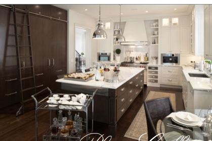
On another note, here are 2 rooms (from Traditional Home) for your consideration:


Both are restful, neutral, contemporary rooms.   Know what keeps them from being kind of cold and stark?  It's the drapes.  Draperies are the unsung, forgotten and neglected heroes of most rooms.  We invest so much time and money into furnishings and accessories and then often wonder what the heck is missing.  I'm here to tell you--it's draperies, window treatments, curtains, whatever you want to call them.  They warm up and finish a room.  Please don't forget them and don't fret about the cost. You can be creative here--but please, no dishtowels on curtain rods!  Draperies are worth every penny that you spend.  Ballard Designs has great, affordable ones.  Get the longer 96" lengths so that you can pull your rods up higher.  I saw some other nice-yet-inexpensive drapes somewhere else recently.  Will post that later when I remember.  Oh, it was Pier 1.  They often don't have the longer lengths, though, so you may have to be more creative (to add more fabric to the bottom or top--you can do it!). 

While you're at it--when buying mass produced cheapo drapes, go to your local fabric shop and buy some trim.  Glue or stitch said trim to your drapes.  Voila.  Much better.  Now they're really yours.

Ciao,
Anne
(now I can't get my words over to the left--I'm tired of relearning!)

Wednesday, April 7, 2010

Another project completed!


This is a small project, but dear to my heart. The bookshelves over the desk in the kitchen were always messy. Try as I might, I could not make them look tidy.


So I ordered cabinet doors from Paul, painted them myself (oil based paint--never again--too darn much work) and Mike installed them. Don't they look 1000% better? On the inside of the door on the far right, I painted the center panel with chalkboard paint. It's fab.

I'm having a very hard time with the blog and the new laptop. I suppose it's something different about Windows 7. Will have to figure it out pronto.

Ciao,
Anne

Saturday, April 3, 2010

The world is a beautiful place


Happy Easter to all!


Ta Da!

Before


After


Man, I am one slow blogger. Above is the finished result of the fireplace project. Not bad at all! I learned a few things along the way, as always, and found the whole process very interesting. It lightens up the space and looks more updated. Peter, the sheet rock king, made everything above the mantel look smooth. Paul, the carpenter, did a great job on the illusion of a lintel and legs.


All Mike and I had to do was paint, and that slowed things waaaayyy down. We are not great painters, even on simple projects. The sheet rock took 2 coats of primer and 4 coats of paint! Why? Why? No idea. The sheet rock was smooth and beautiful, but the paint just didn't look good until the end. The wood pieces took a coat of primer and 3 coats of latex gloss paint. The more paint, the smoother the end result. Another coat would mellow it out even more, but I'm not touching a paintbrush again for a while. I've also been painting another, smaller project. Will show you that one next time! I'm slow, but things keep chugging along.