I've got some photos on my website, DeCocco Design under the Portfolio tab, but thought it would be helpful to have a few more shots here on the blog. I'm not a professional photographer (obviously), and rooms are much harder to capture than cute kids or dogs, but I've done my best! The bottom line is that I've got happy clients because their rooms reflect their personality, are easy to maintain and make them smile when they come home.
Before
Sometimes it's more about what you take away....
After
That makes the biggest difference in updating a room.
I never make a portfolio without including a picture of this project It was long ago, but it's a favorite, low cost, DIY idea that can go into just about any space. Here it is over a fireplace.
Here it is on a larger wall in a different home.
Here it is on a much smaller scale--just one rectangle. It can make a small object more proportionate to the space.
Eat-in kitchens should be charming and inviting.
Get some texture in the room through pattern and finishes.
Ok, I didn't design this guy, but isn't he something? He lives at the NC Zoo.
Back to work.
A graphic piece of art enlivens the space and the framed artwork by a child will brighten every meal.
Foyers can be welcoming and calm.
This was a large brick wall with only a mantel on top of the firebox and wood box. We added the surround and sheet rock to give it an update.
Family heirlooms belong on display.
Elegant finishes that provide sparkle and texture.
Don't ever be afraid of color!
A cozy room where lots of people can sit and relax.
I love to design built-ins. They are the miracle workers in a busy home.
More built-ins, custom designed to meet the needs of the client. There are a LOT of toys behind those cabinet doors. A place for everything.
An oak built in shelving unit with plenty of storage.
Not exactly a built in, but a new closet space, configured to provide more options for easier storage.
Travertine tile with glass tile accents and a lovely polished granite top.
This is a nice mix of feminine and masculine finishes in a beautiful bathroom.
Before
After
Just choosing something that fits in the space can be a challenge, but what we found for this kitchen worked out so well--like a seat in a favorite coffee shop! Keep it simple.
Before
After
This is not a spectacular room, but it's exactly what the client wanted and needed--he can entertain, watch TV, study or review paperwork. Think about what you want AND what you need. You can have both!
This is my kitchen. Old, painted cabinets mixed with a few contemporary touches. I love being in this room.
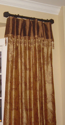
Pretty brown silk toile drapes on a short rod.
Ok, this shot obviously wasn't staged in any way, but I had to include it because it shows you that you can put some cabinetry in the low part of a pitched ceiling to stash toys in a bonus room. Excellent use of space--took up NO interior floorspace!
A comfortable, contemporary bedroom.
.jpg)
.jpg)
.jpg)
.jpg)
.jpg)


+-+Copy.jpg)


