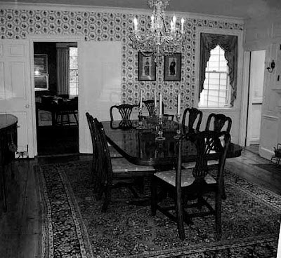
Oops! This is the "Before" shot.
Here's the "After."
And this.
The color on the walls is brave and perfect. I looked for the name of that orange in the Resource pages, but it was a custom color. However, Sherwin Williams' Robust Orange/6628, is a similar rich hue. Benjamin Moore's Corlsbud Canyon/076 is another delicious, saturated orange. Blue is the complementary color to orange, so the huge vase of delphiniums on the table was a brilliant stroke. The chandelier, the window treatments, the clean lines on the upholstered pieces--so well done. This room is filled with many details that add up to great design and a space that I'd feel very comfortable and downright happy in. While this is a very traditional room, the use of color and fabric give it a gorgeous update. Gerald Pomeroy of Boston did the interior design and the photographer is Francesco Lagnese.
There was another good "before" and "after" in the magazine.
The bathroom before
Lots of good ideas in this photo, don't you think? Also by Gerald Pomeroy Design Group.
I hope you all enjoy the rest of the weekend.
Ciao,
Anne


No comments:
Post a Comment